

WCAG ACCESSIBILITY RESEARCH & IMPLEMENTATION
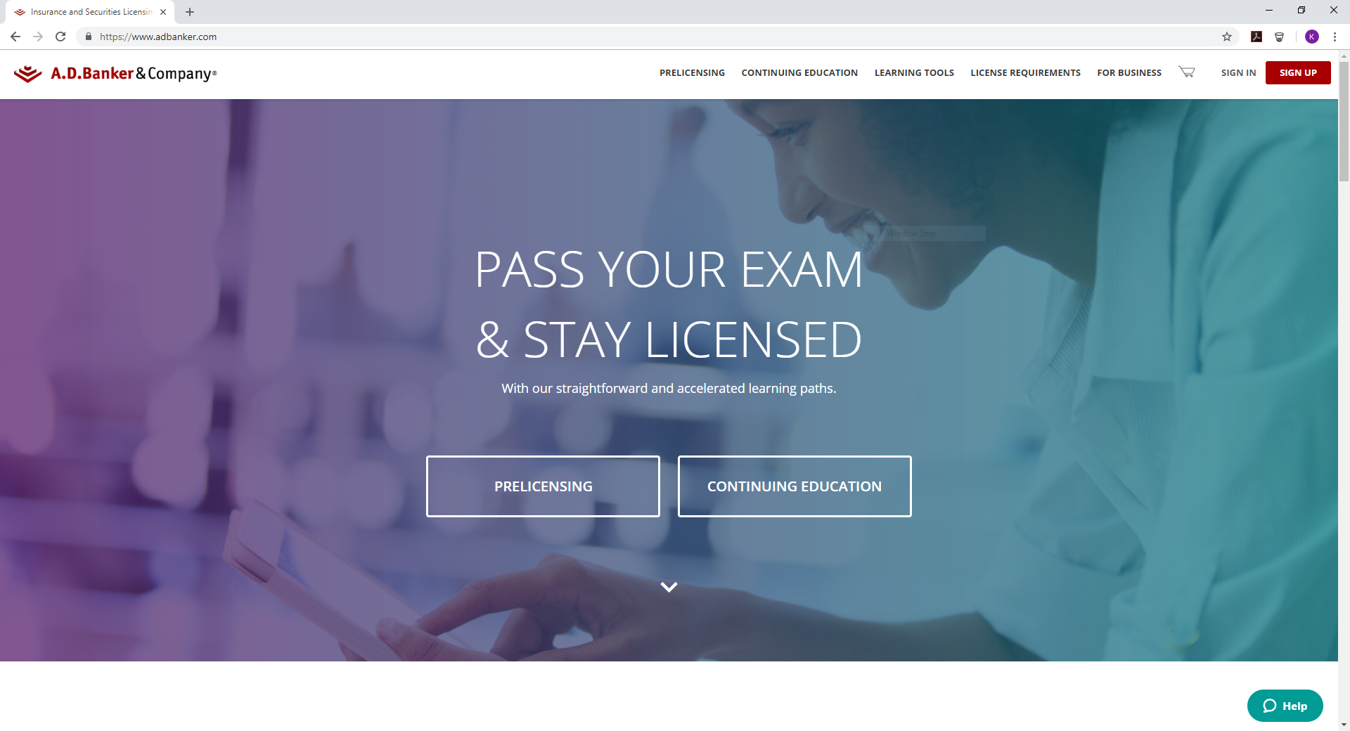
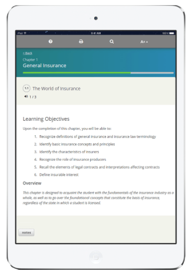
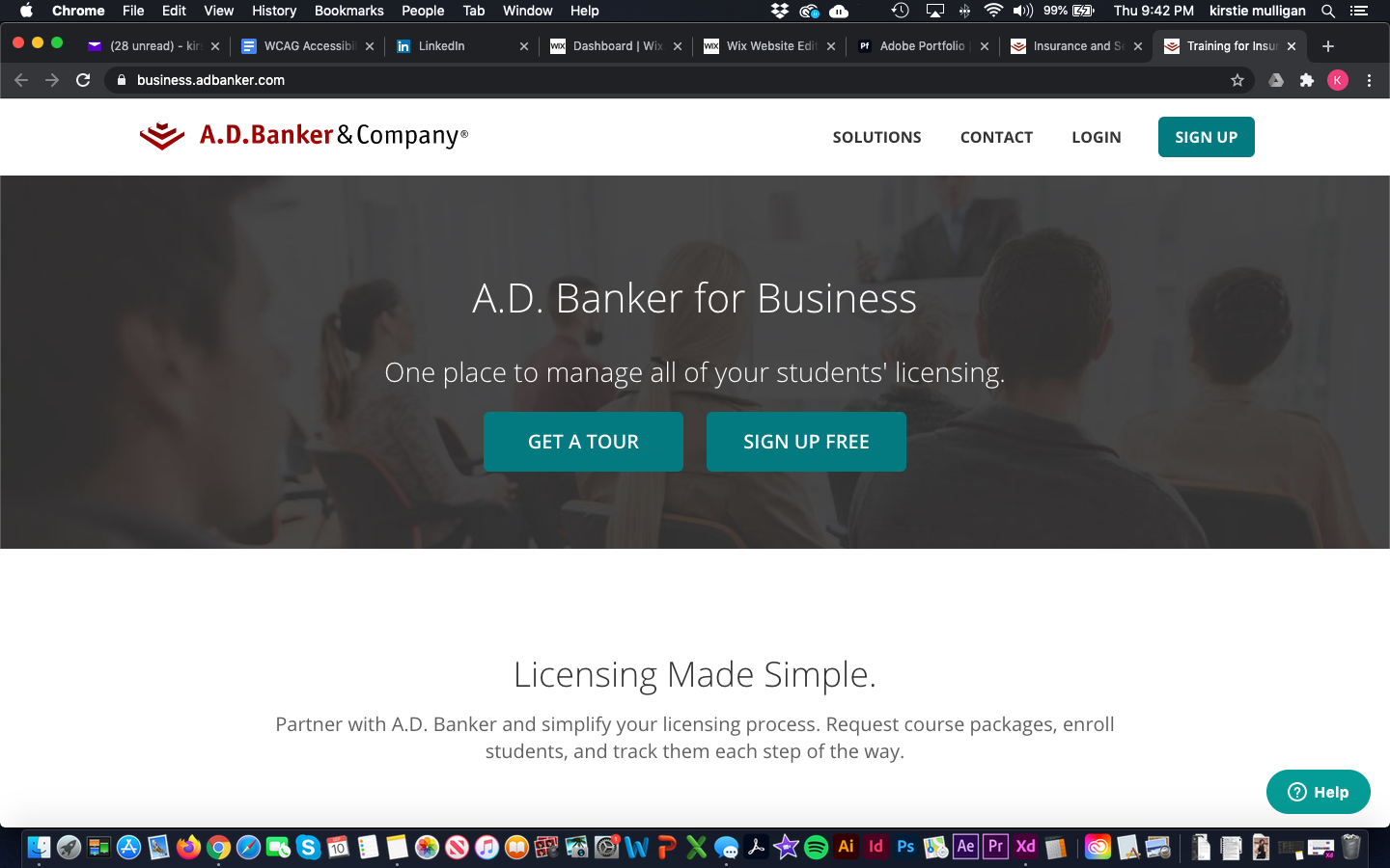
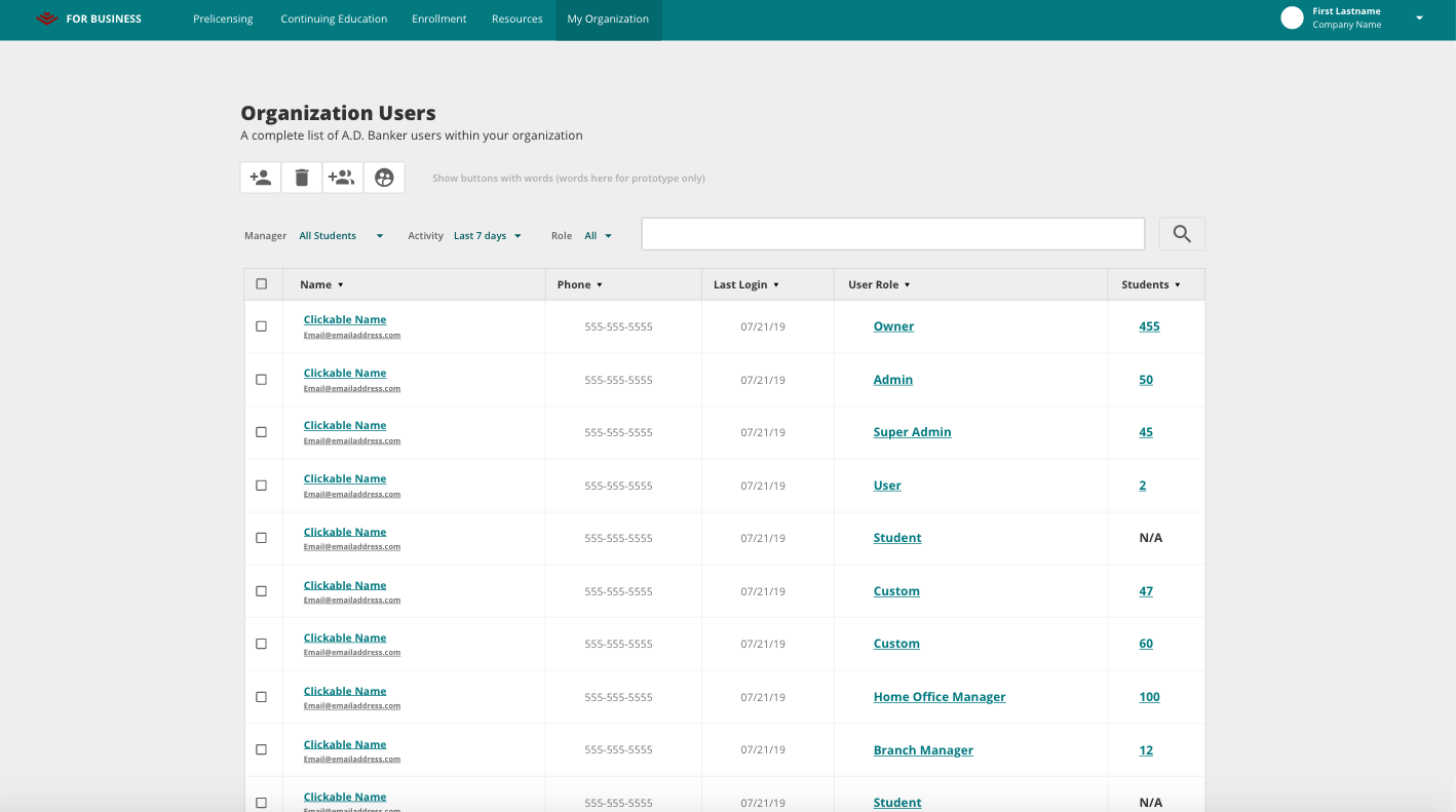
Working for a B2B company in 2018, several of our contracts presented us the challenge to work through our four products and platforms to ensure they meet WCAG Level AA Standards. Because we provided essential training to many companies, this ensured our services wouldn’t prevent anyone from learning the necessary information.
I was tasked with learning and interpreting the guidelines. The next step was to audit our system based on my research, and finding areas for improvement on each of our four platforms. Using Google Docs, I documented areas of improvement, and categorized them by level of importance and where they were located within each site.
As I documented the issues, I additionally provided solutions or necessary actions needed to fix the issues. For example, any color contrasting issues I ran across, I would provide an alternative color to meet standards, or if there were keyboard navigation issues, I would provide the appropriate code snippets needed to properly navigate the area without a mouse.
After the audit was thoroughly documented and evaluated, I took the findings and began writing up itemized tickets in an agile process for the development team to complete in several rounds of Sprints. Throughout the sprint process, I provided guidance and clarified issues as the developers worked through fixing the problem. Additionally, I would QA their solutions to ensure it worked as intended while also maintaining the integrity of the product.
Through this whole product I sprouted the overall development of a design system for this company’s ever evolving identity. Learn more about the design system product development.
After approximately 9 months of research, auditing, development, and QA, all four of our platforms met WCAG Level AA requirements. Additionally, a design system ,as well as technical documentation, was established for consistency and clarity among all current and future components and pages within each platform.
RESOURCES
Articles
https://uxdesign.cc/accessibility-guidelines-for-a-ux-designer-c3ba775539be
https://designmodo.com/web-design-accessibility/
Guidelines & Explanations
https://www.w3.org/WAI/standards-guidelines/wcag/
https://webaim.org/standards/wcag/checklist
https://a11yproject.com/
https://developers.google.com/web/fundamentals/accessibility
LEARNINGS FROM RESEARCH
WCAG Accessibility Standards are a set of guidelines set by W3C to provide actionable steps and guidance to ensure your product can be accessed by as many users as possible.
My focus on this topic is within accessibility and usability of products for as many users as possible. There are additional types of accessibility and representation to take product inclusion to the next level better discussed through other organizations.
What is it and who does it affect?
WCAG Accessibility allows all users (of any range of ability) to understand, utilize and delight in a product to the full extent no matter situation, cabilities, or context. It means more users can use a product no matter situation or capabilities, whether permanent, temporary, or situational.
Below are just a few visual, hearing, and touch examples of impairments that could fall into one of the three categories of disabilities: permanent, temporary, or situational.
Permanent: Blind/Reduced Vision, Color Blind, Epileptic, Deaf, Hard of Hearing, and Cerebral Palsy
Temporary: Cataracts surgery, Eye Dilation, Migraine, Ear Infection, and Broken Limb
Situational: Bright Sunlight coming in a window, Images not loading/poor wifi, In a public space without headphones, and Mouse Died/Trackpad not working
As you can see from the examples, there are a wide range of issues that could affect a user from utilizing your product as intended. By adhering to WCAG guidelines when creating your product, you provide a wider range usability for all users, no matter their situation or technology.
Reasonable Accommodations
I realize occasionally there will be business and/or financial cases for not meeting the guideline, but in those instances you should provide a reasonable accommodation or place to request information needed or contact you as issues arise. Ultimately, the better usability option is to not have the user troubleshoot and contact for assistance, but the reality is that the fix can be costly and take resources that the business can’t handle at the current time. So providing a resource or contact as issues arise can be the patch to help until resources become available.
LITIGATION
Anyone who falls under the freedom of information act is required to to be accessible. So providing reasonable accommodations can become the necessary work around.
Supreme Court
As recently as 2019, the Supreme Court refused to hear a case against Domino’s, upholding the lower court's decision that maintains that websites need to be accessible for their users. A blind man wanted to order pizza on Domino’s website but wasn’t able to using his Screen Reading technology.
Domino’s Court Case From Fast Company - https://www.fastcompany.com/90414147/dominos-pizza-dealt-scotus-blow-that-could-affect-ada
Additionally, even Queen Bey isn’t immune from litigation. While this was a civil suit, she was also sued for similar reasons, a young woman wanted to order from Beyoncé’s merchandise site and was prevented from doing so.
Beyoncé’s Court Case from The Guardian - https://www.theguardian.com/music/2019/jan/04/beyonce-parkwood-entertainment-sued-over-website-accessibility
Passing and Failing
The WCAG guidelines are a list of levels, tiers, and concepts to strive towards. So just because you don’t meet the criteria in one area doesn’t mean your fail over all. It is more of an ongoing effort to improve the functionality of your website for as many users as possible but acknowledging there might be some business goals and resources that have to be worked through as well.
Additionally some of the guidelines can have different interpretations and levels of knowledge surrounding them. Just look in the comments section on any accessibility blog. There will always be interesting discussions and hot button items that people view differently.
This is why it is so important to test updates and new efforts with users that would be affected or who use software to ensure users are capable of interacting with the product/feature. As well as, why it’s important to allow for real time user feedback because you will never catch everything until real users interact with the product.
As you build products, below are just some of the assistive technology to keep in mind:
- Screen Readers (NVDA and JAWS)
- Text readers
- Braille Display and Transcribers
- Head pointers
- Motion tracking or eye tracking
- Single switch entry devices
- Speech input software
- Screen magnification software
- Adaptive/Modified Keyboards
- Text-to-Speech
In addition to using assistive technology throughout the testing process and manually reviewing areas, you can use a couple of browser plugins to provide highlights of problem areas. WebAIM’s Wave and Google Lighthouse are just a couple of plugins that provide page specific breakdowns of accessibility improvements needed.
Principles and Key Areas of Improvement
The WCAG guidelines are broken down into four different Principles, with varying levels of satisfaction: Perceivable, Operable, Understandable, and Robust.
Perceivable
Your content is accessible for the senses of sight, hearing, and/or touch.
Operable
Your content and all of its elements and navigation need to be operable by all users and technology.
Understandable
Information and operation of the product need to be understood and easily interpreted by users and the assistive technology.
Robust
Content within the product must be informative and robust enough to be interpreted by a wide variety of users and assistive technology alike.
ACTIONABLE IMPROVEMENTS
Below are many, but not all, of the key actionable improvements to take into consideration when reviewing or building a product with accessibility in mind. For specific coding snippets or exact language regarding WCAG accessibility, visit w3c.org.
Navigation
- You product can be exclusively navigable by only a Keyboard or using an adaptive keyboards
- Elements on the pages are navigated using a keyboard in a semantic order (as they would appear / be navigated naturally)
- Navigation and elements repeated site wide should be able to be skipped using keyboard navigation and screen readers
- Lock the keyboard focus and navigation to any pop up window or area until action on the screen is taken
- Focus rings on every element should be visible when active. Do not make the outline = none. While it is prettier, it hides the visible navigation for keyboard users as well as screen readers.
Code
- HTML is written Semantically with tags used properly throughout each page. For example: one H1 per page, and H2-H6 descend in level of importance throughout each page, and bodies of text are contained within <p> tags.
- Use ARIA labels when HTML labels and focus isn’t sufficient. This will help screen readers narrate actions needed more accurately.
- A formal “Label” tag is required to be associated with each input.
- There are ways to include it in the code without it being seen which would allow screen readers to make the association if you have other visual cues for the input.
Color
- Color not the only visual que when making an indication or alert. Use descriptive text and appropriate symbols
- Color Contrast Ratio should be at least 3:1. Use WebAIM’s color contrast checker to aid your color combination journey (hint: white will never have enough contrast with colors like cyan and yellow)
Images
- Text should almost never be used on an image
- Alternative Text needs to be included on essential images
- Decorative Imagery such as unclickable icons or decorative lines should use a blank alt tag. This allows screen readers to skip over it while navigating, reducing the overall noise while navigating.
- There has been debate on what constitutes essential vs decorative, but if it would cause more noise in navigating to write descriptive text, then I would personally deem it decorative
Text
- Text can be resized or enlarged without loss of usability or readability, or at the very least text meets 4:5:1 contrast ratio (large text minimum is 24px)
Video, Motion, and Interactive Elements
- Videos using sound should utilize Closed Captions, or even better, have an interpreter visible on each video
- Provide start/stop on videos, or even better, don’t allow video or moving elements to start automatically
- Reduce any flashing or motion elements to less than 3 seconds of animation
- Pop up screens should never just pop up. Only use pop ups when users are expecting an interaction (i.e. they clicked a button which brings them to a pop up)
Indicators
- Error indicators are clear and helpful, and rely on color to indicate status
- Allow for time limits/session expirations to be extended and warn before timeouts
- Interactive elements behave consistently throughout site and are expected interactions
- When alerts or error indicators appear, the focus ring should default to the notification on screen
Buttons and Clickable Elements
- Clickable areas are minimum 44px by 44px
- Must abide by color contrast standards
- An exception can be for disabled buttons, though there’s debate on this topic that could go back to not allowing color to be the only indicator
- Provide descriptive text regarding action taken with the button (i.e. don’t say “click here” or “more details”)
Site Wide Considerations
- Interactions and page elements should be device agnostic
- Website has an identified language in code
- Allow for multiple points of entry to page
Now What? Next step Actions
While working through improving accessibility and/or incorporating it into your next project, consider also adding an Accessibility Statement page to your product. This page would provide a platform to explain the measures you’ve taken so far to ensure accessibility and where you plan to go, admit there may be areas you missed, and provide a way for users to submit feedback and disclose where they find areas to improve.
Most importantly, when those suggestions come in, act on them! Review, strategize, and implement the usability changes your users find. Listening to your users is key and constantly listening and learning from them is vital for usability and accessibility in a product.
“Accessibility benefits everybody, not just the disabled. Create an inclusive world”
- Disabledspectator.com
Summary
In the end, the best way to improve product accessibility and usability is to keep learning and trying to improve the knowledge gap. Know you won’t catch everything, that’s what’s great about user testing! But also provide a resource, web page, and/or contact form for users to submit suggestions or findings for improvements.
Do your research to learn more about the intricacies of making your product usable and device agnostic. At a very high level:
- Make sure the product is coded semantically to allow for natural navigation
- Colors used have a deep enough contrast and aren’t the only visual indication of actions required
- Visual elements have an alternative narration as alt text or CC
- Elements don’t move unless users say so and interactions should be expected actions of the element.
Also know that while accessibility is the best option for usability, sometimes it comes down to resource allocation or business decisions, and if that is the case, then provide a reasonable accommodation or way for users to reach out.
Most importantly, be open to feedback from users and make the necessary improvements when feasible! This provides more opportunities for a larger set of users and devices to access the product and provides a happier experience for all. Following the WCAG guidelines begins the process of opening up your product to become more inclusive than ever before.
