A.D. Banker & Company Website
Through many rounds of UX/UI research, wireframing, prototyping, building images, and coding the home page (html/css/scss), A.D. Banker’s website was transformed into a responsive website that follows current trends, and the secondary and tertiary pages were updated to match as well. This project was initiated after I worked to create a directory of courses offered by A.D. Banker. The objective was to create an easy to maneuver course directory that had an up-to-date appearance and is easy for search engines to interpret. Both the ADBanker.com along with the secondary course directory pages were created due to the need to better visually explain what values, features, and products were offered at A.D. Banker and Company.

The Problem, Process, and Solution
What I did:
Updated the layout and responsiveness on the main pages on the website using HTML and SCSS/CSS to match current industry and web trends while retaining the current C# and JS frameworks. Additionally, I created new custom feature specific icons and color combinations, as well as moving visuals used to visually explain certain features. By updating the appearance of the website, I then worked with coworkers to update the brand styles used beyond the website to create a cohesive look.
Why:
A.D. Banker’s website was over 5 years old, and not mobile friendly or visually updated to current trends in design and user experience.
Project That Started It All:
What I Did:
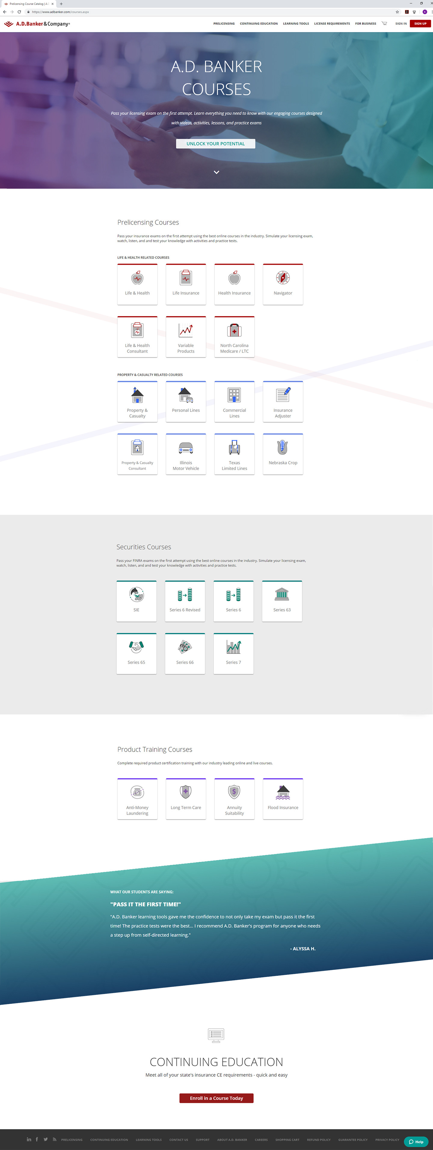
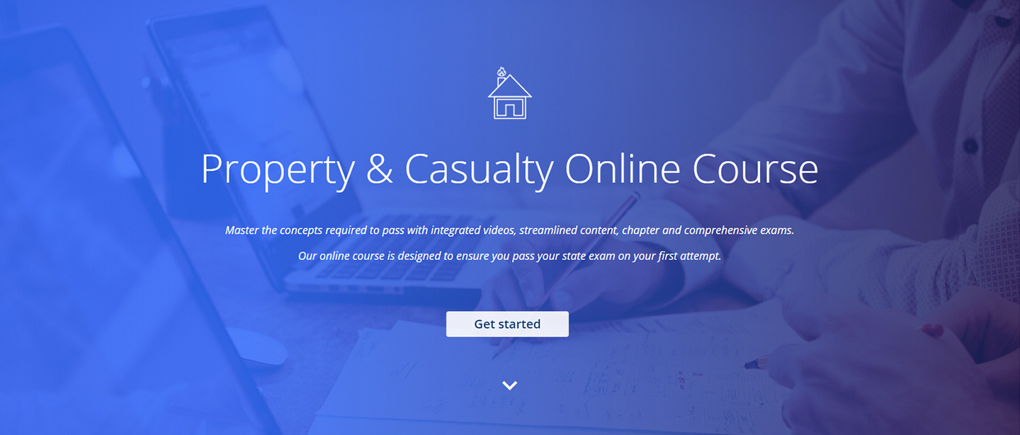
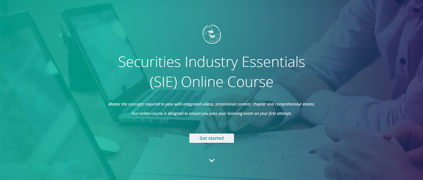
Created a new subsection A.D. Banker’s website to promote and visually organize the variety of courses, products, and features offered.
Specifics:
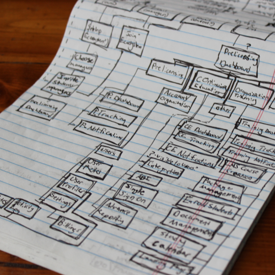
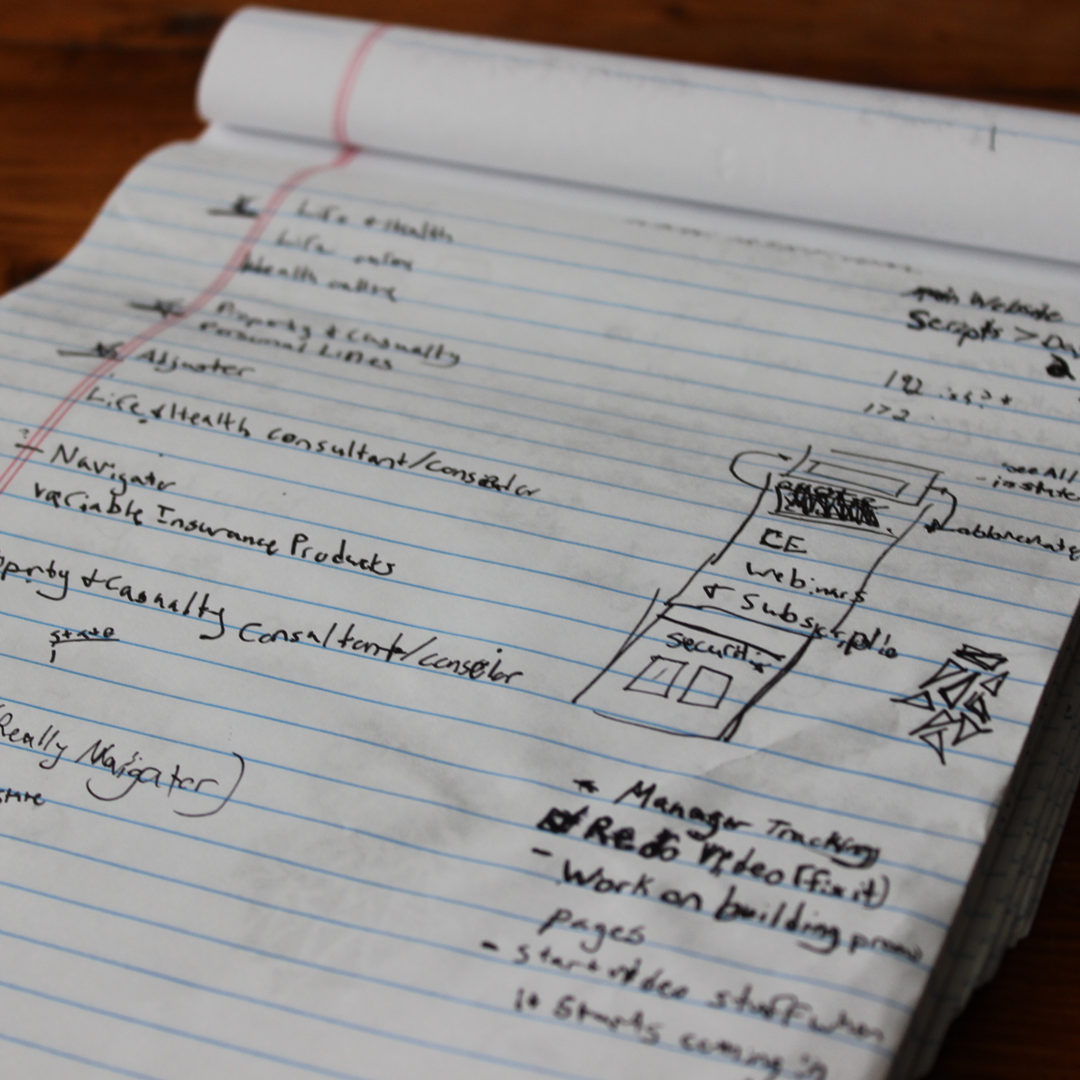
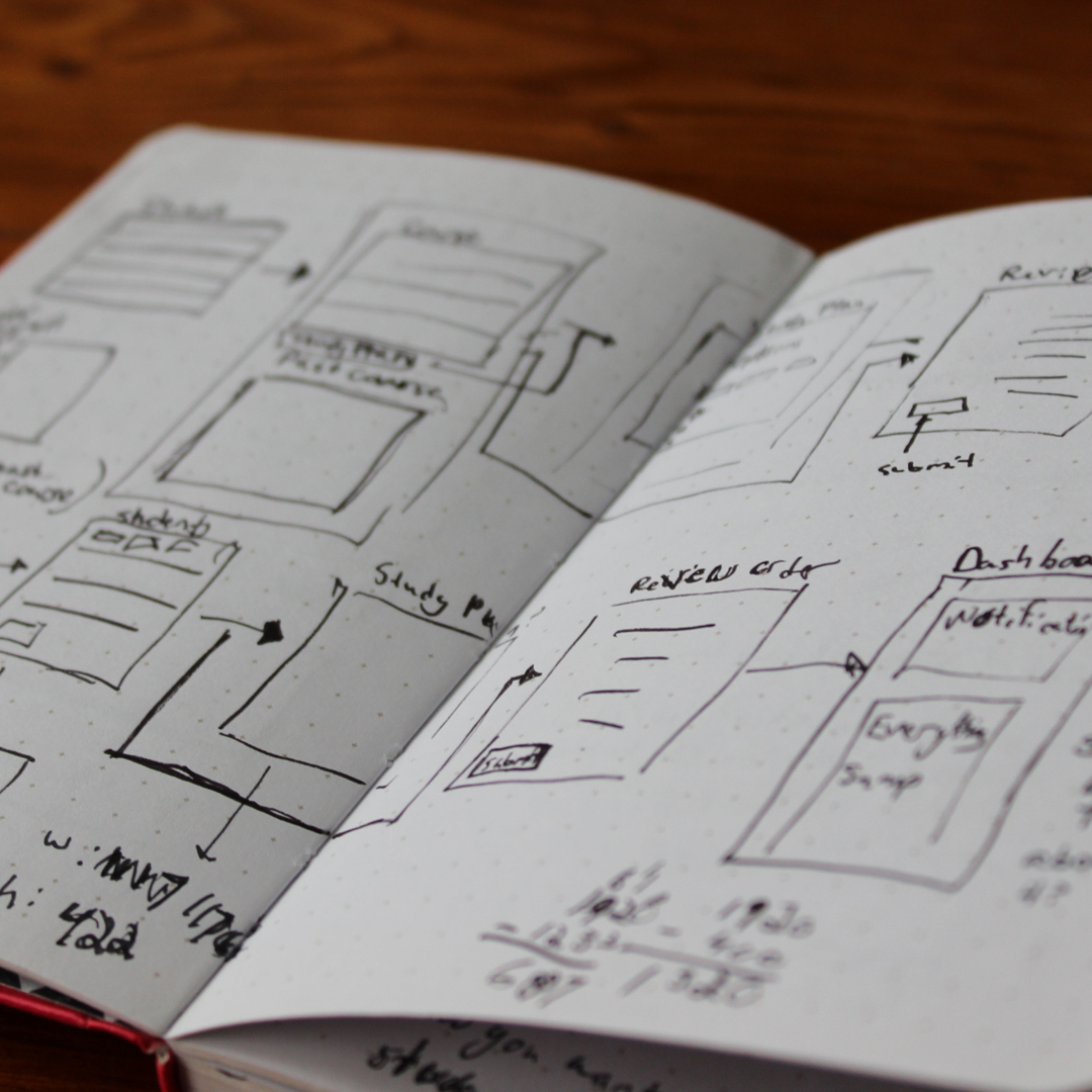
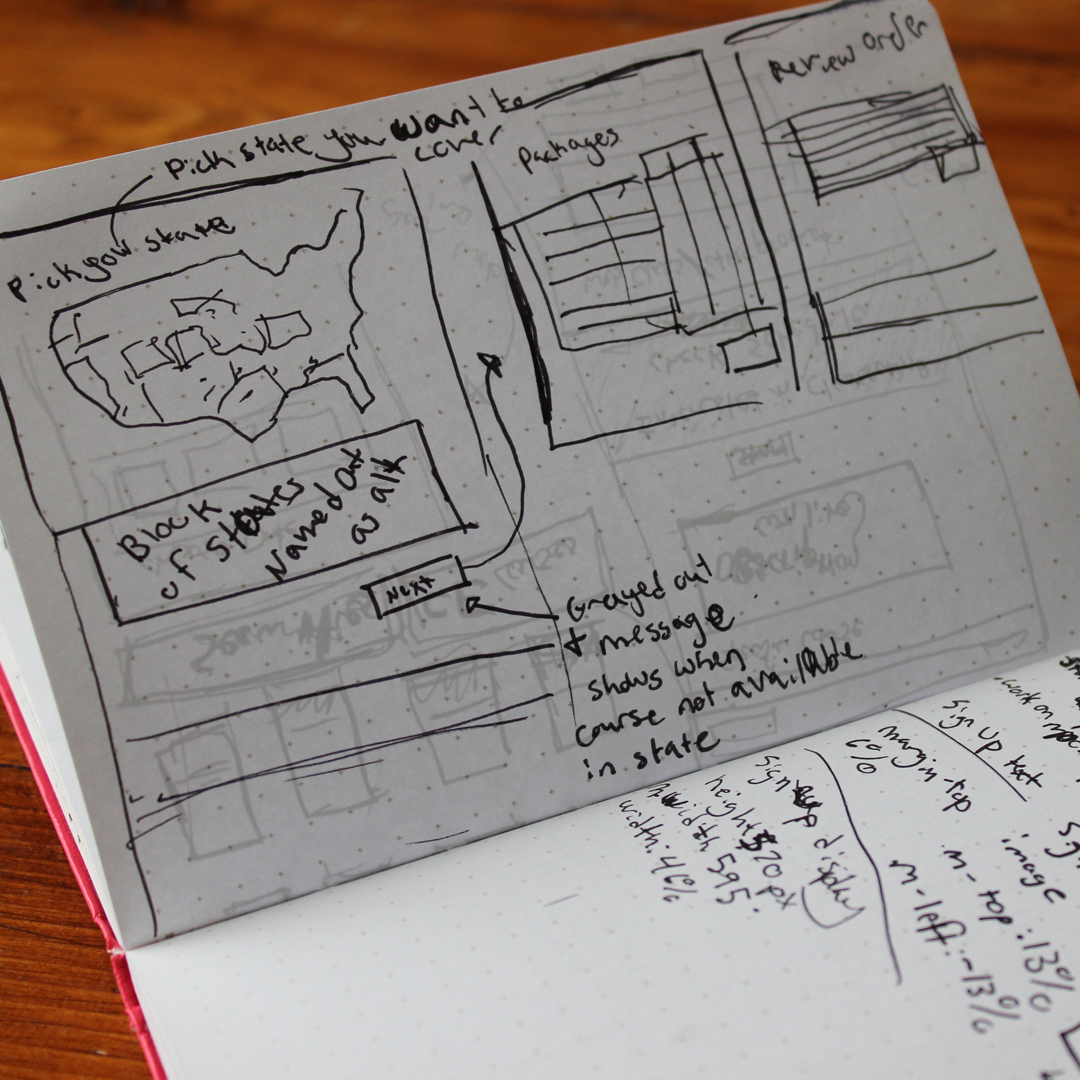
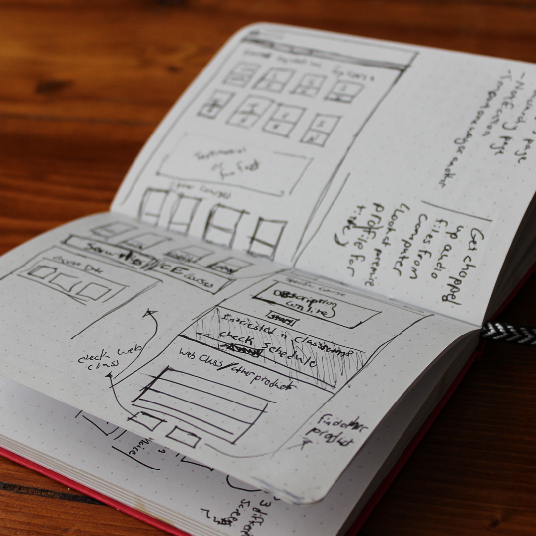
UI/UX Research and Audit of other course-based learning websites
Website Design and Ideation
Html, CSS, and an aspect of JavaScript
Icon Design
Problem To Be Solved:
Our current method for selecting learning courses is helpful when looking at products in specific states, but it lacks many essential features to attract new users. It does not provide in depth explanations about a course and what features are offered, nor is it organic search friendly, meaning Google couldn’t see what we offered. The upside for this design was you could look directly into your needed state to know if we offered the class for that state with minimal amount of clicks.
Proposal:
Instead of completely wiping out the option to look up their state, we created a subsection of the website that would allow a user to look into specific courses or go straight to their state to begin the purchasing process. Throughout several points on each of the courses promotional pages there were the specific Call to Actions which would take them back the state specific pages. To check their course.
We decided upon creating promotional pages on a different part of the website was a good compromise to allow new users to browse through our options on a higher levels while letting decisive users the ability to directly find their needed pages to make a purchase. Additionally, these promotional pages would allow us search engines to see the products we offered to users who are interested in those courses.


Additional Discovery:
After creating these pages, we explored the amount of time and effort updating the visual side of the front page was explored and decided should be the next step.
Additional Problem to be Solved:
How to update our website, mainly the home page, to match current trends and the promotional pages create while also maintaining the current C# and JavaScript framework in place.
Steps Followed:
Through many rounds of UX/UI research, wireframing, prototyping, building images, and coding the home page (html/css/scss), A.D. Banker’s website was transformed into a responsive website that follows current trends, and the secondary and tertiary pages were updated to match as well.